Branding & Campaign
Secure Comfort is a conceptual lifestyle brand centered around softness and protection. The campaign uses space imagery and bold pixel typography to frame comfort as something elevated and protective — “out of this world.”
POSTERS
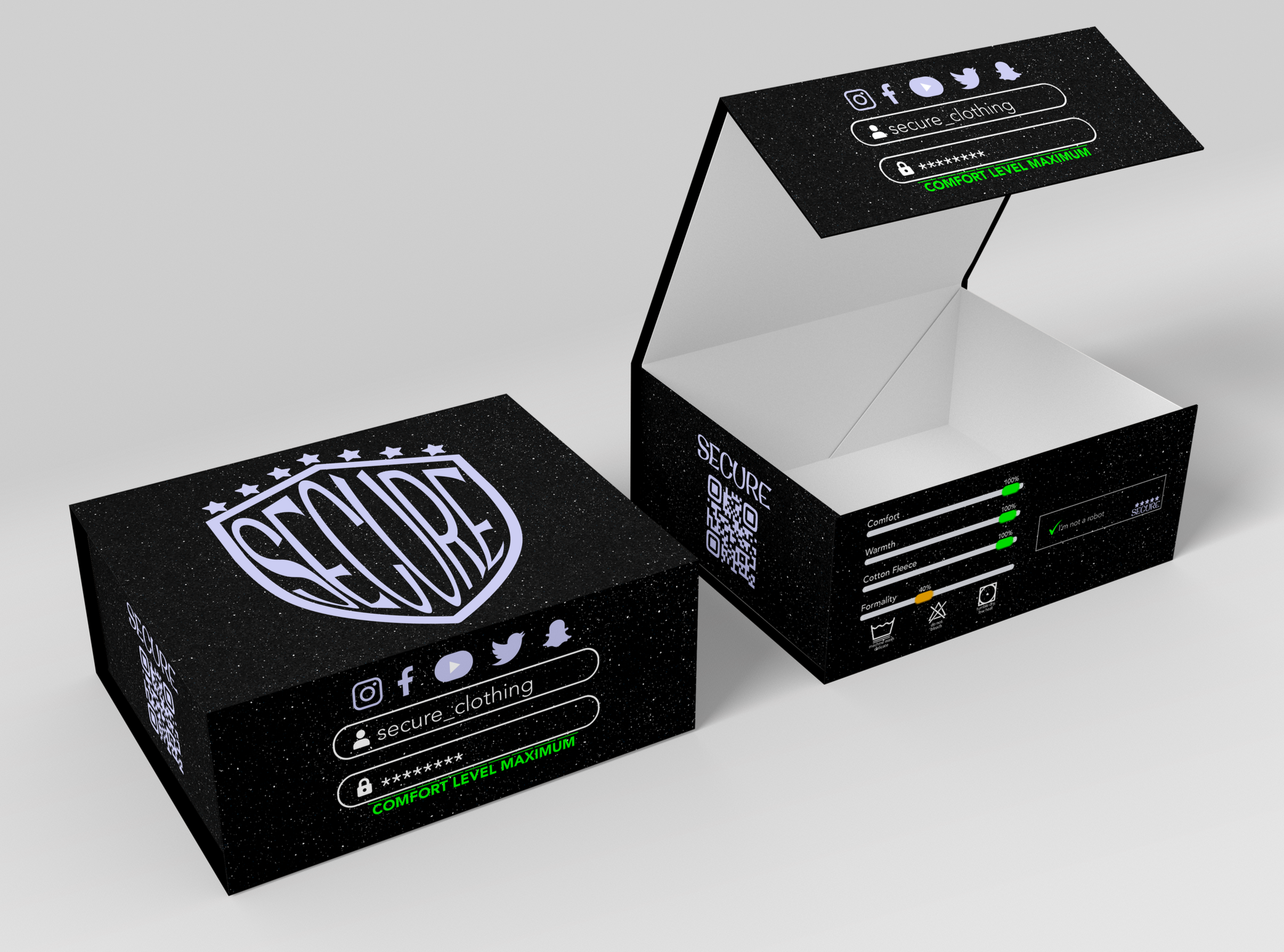
Packaging
The concept takes inspiration from computer interface elements such as login screens, sliders, verification prompts, and CAPTCHA systems. These visual cues are used to highlight product qualities like warmth, comfort, and cotton fleece material, presenting them as adjustable “system settings.”
-
![]()
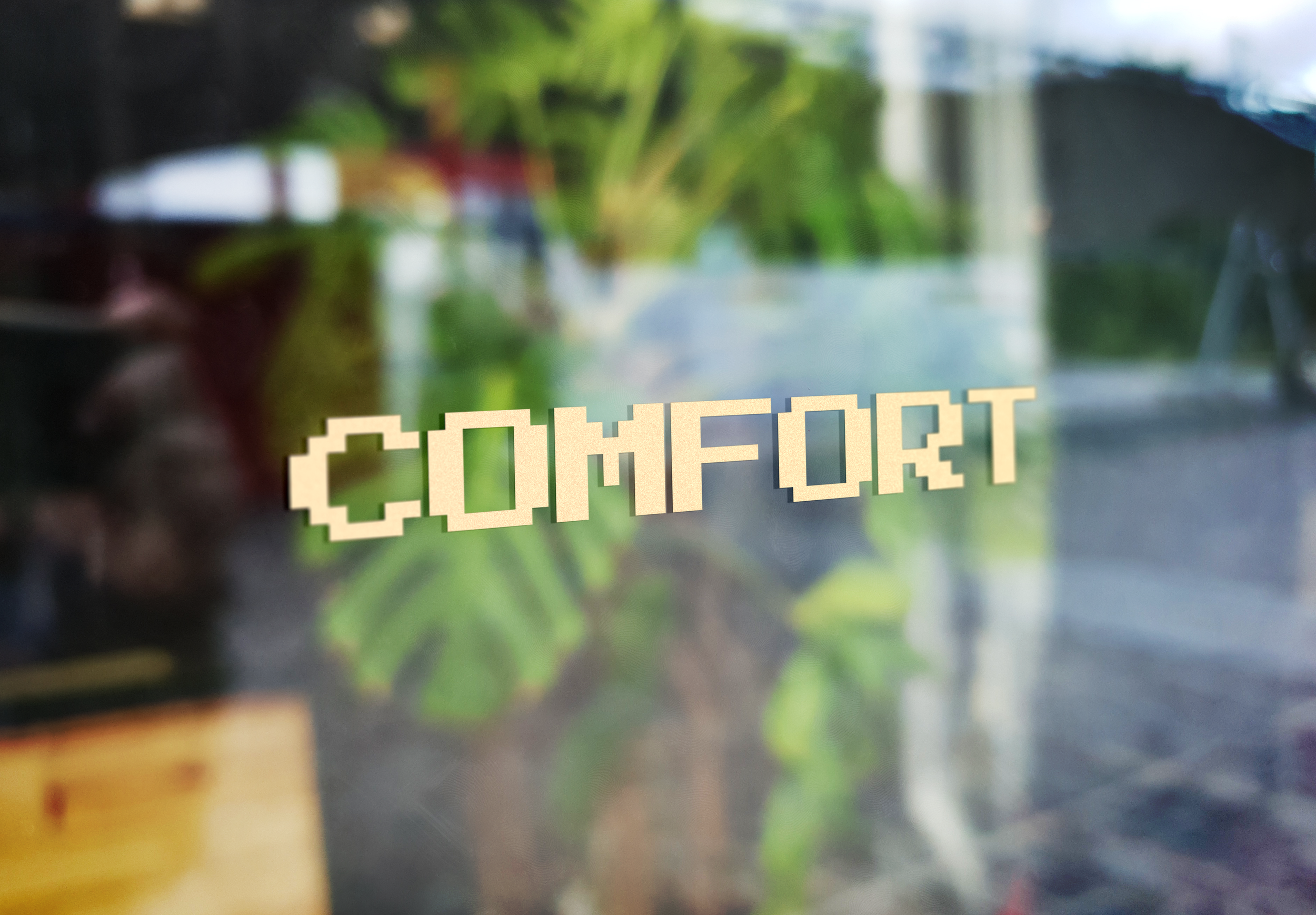
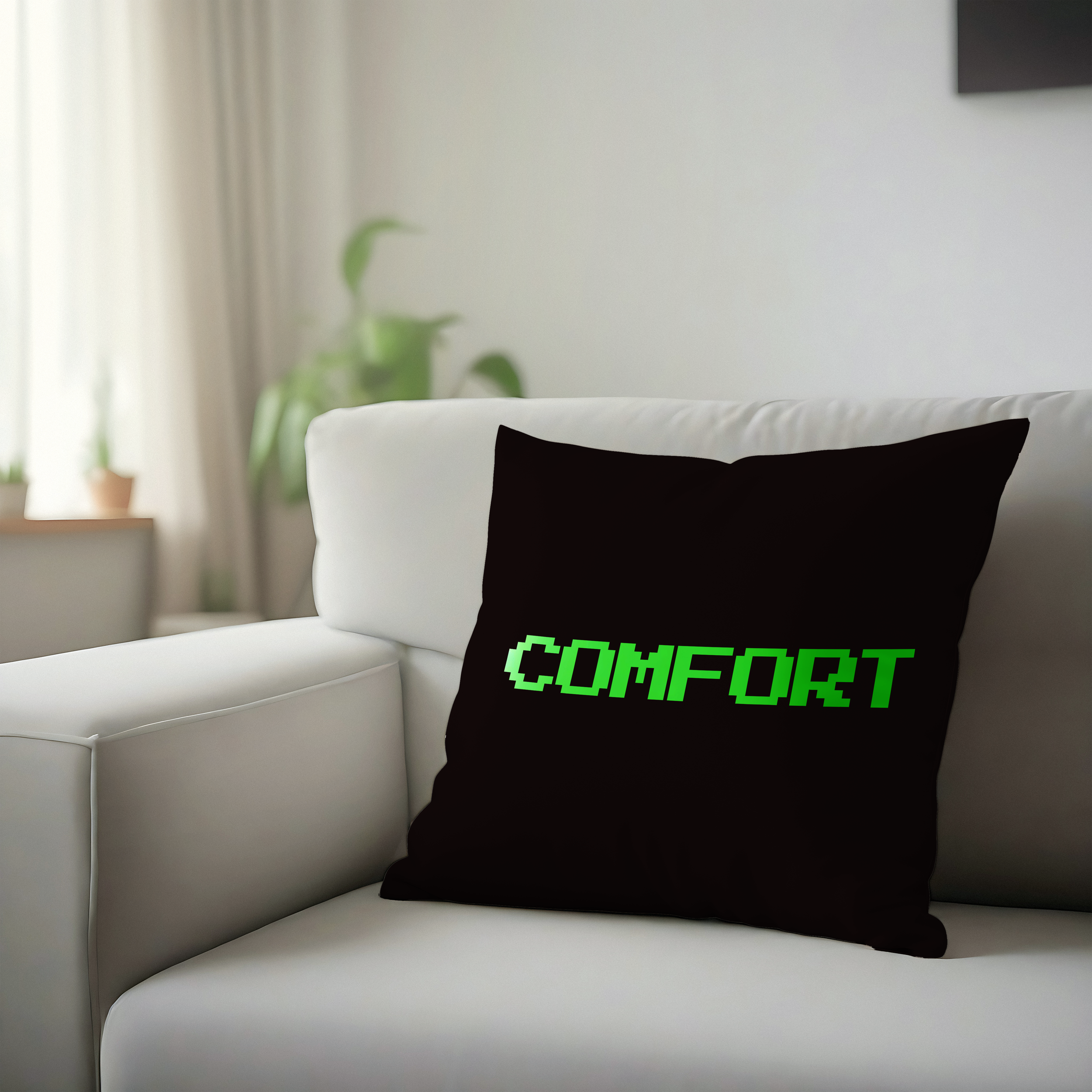
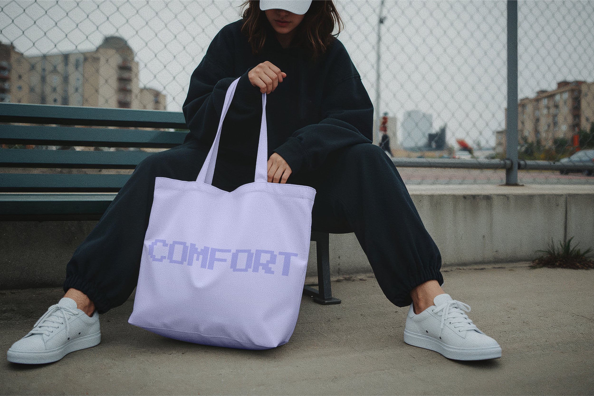
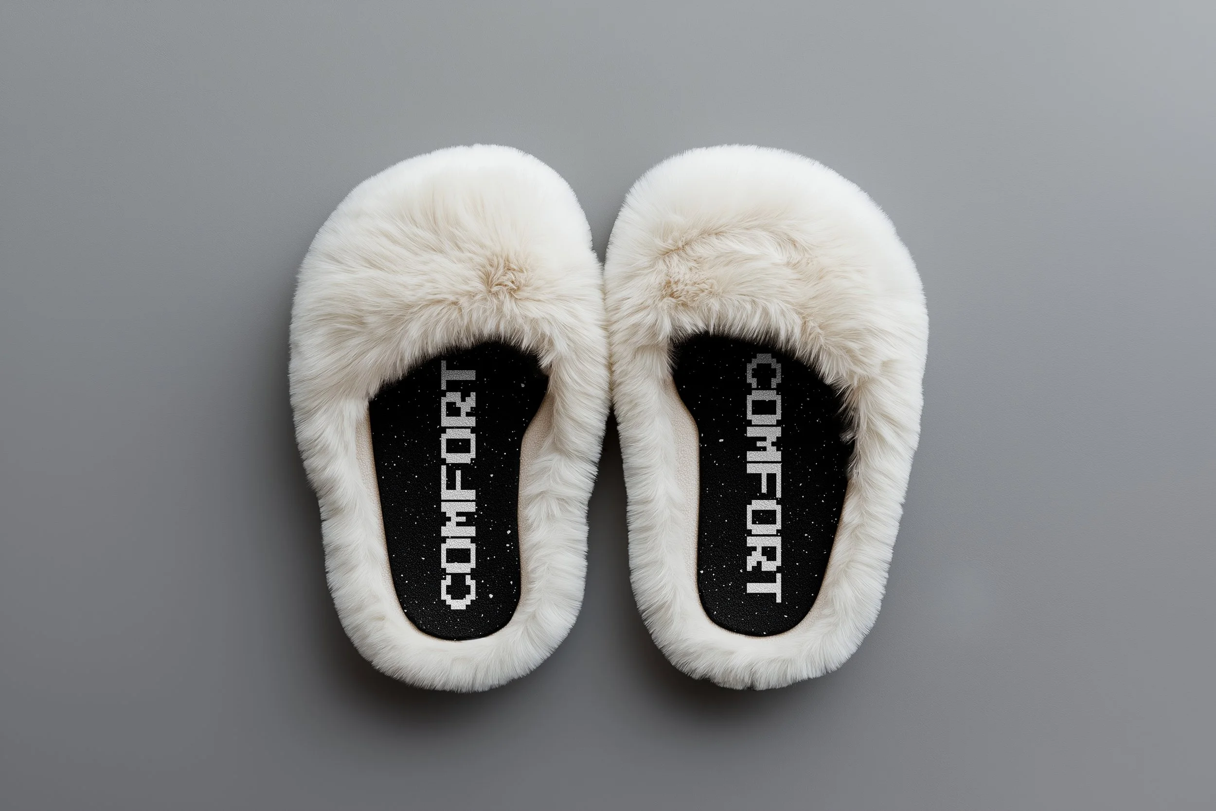
Comfort
-
![]()
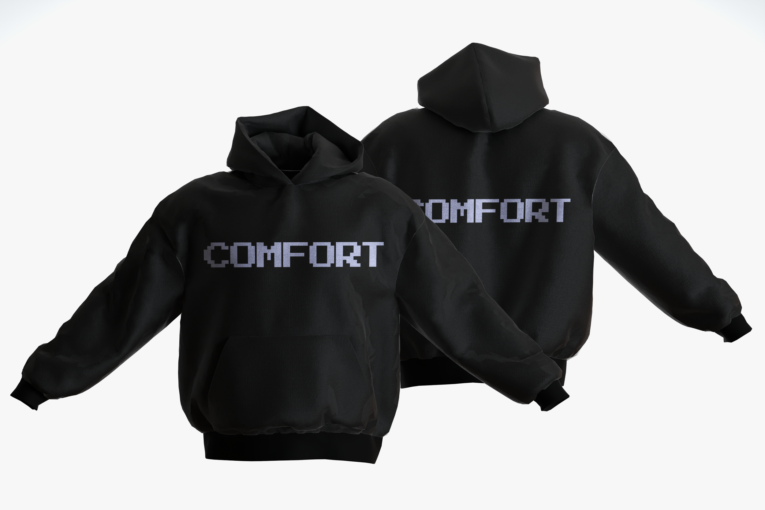
Sweatshirt
-
![]()
Blanket
-
![]()
Pillow
-
![]()
Tote
-
![]()
Slippers
-
![]()
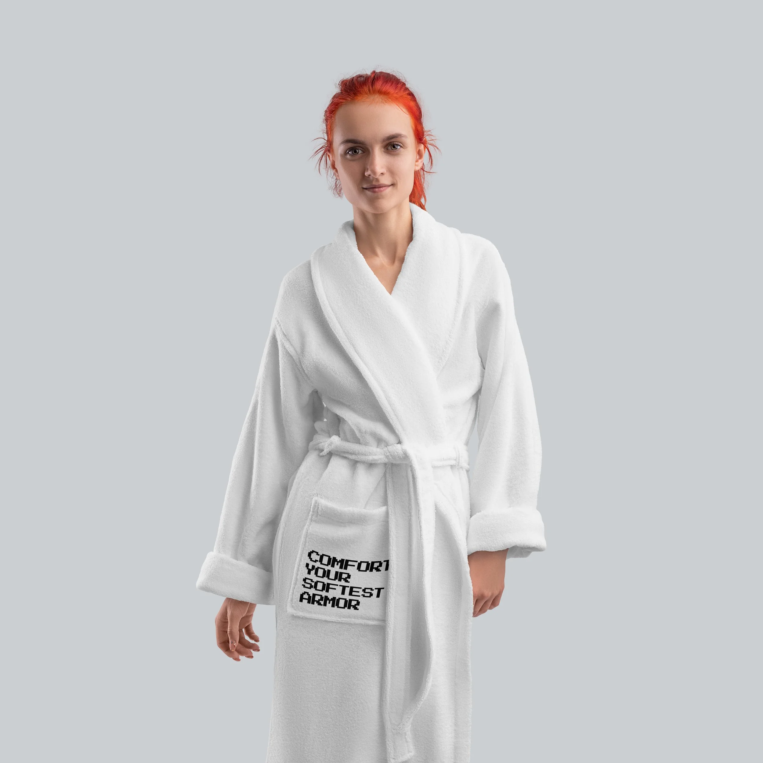
Robe
-
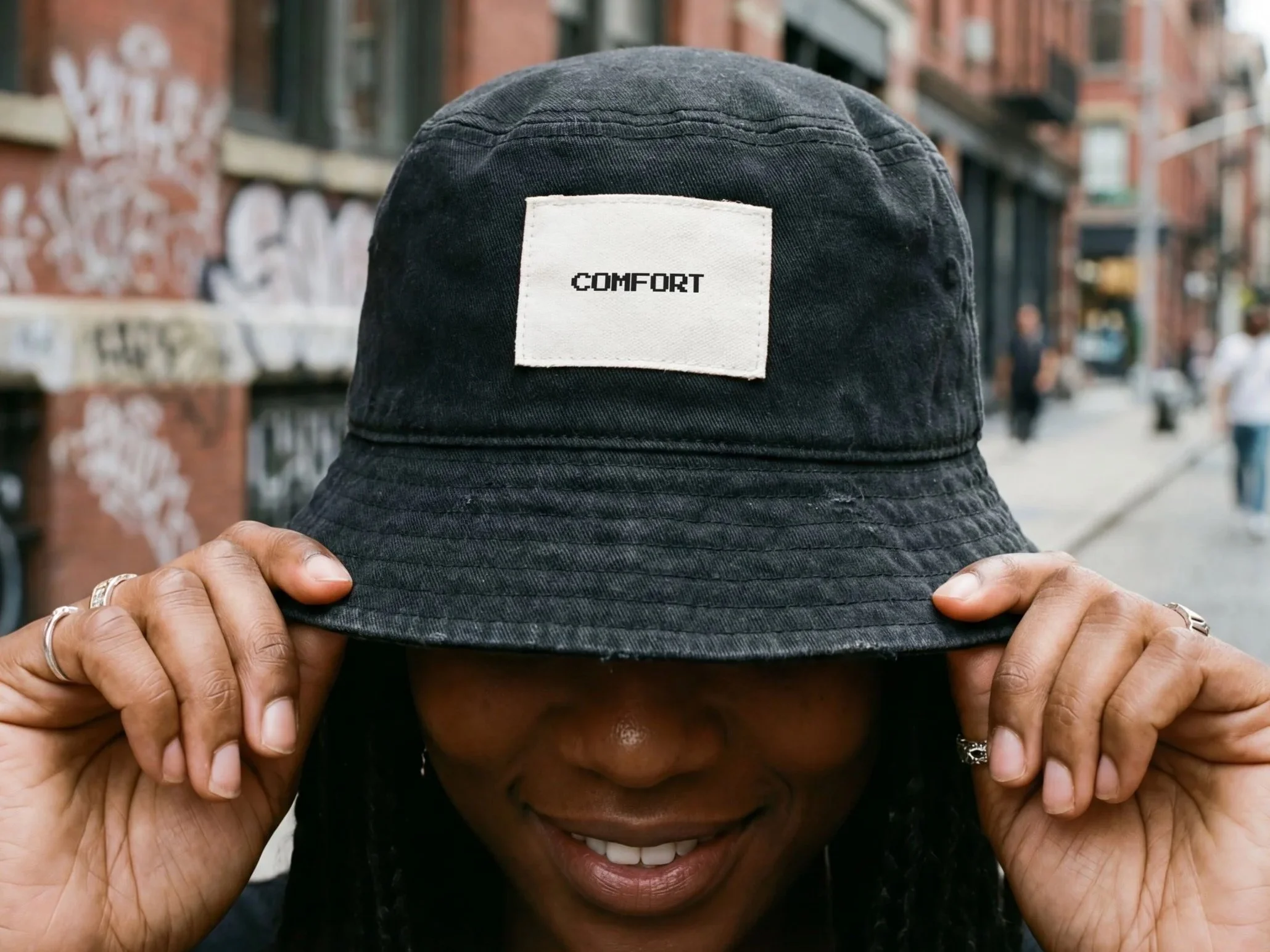
![]()
Bucket Hat
PROCESS
-
![]()
Out of this world comfort
The brand is titled Secure to represent protection, while Comfort is used across the visuals to express the feeling that security creates. This is a conceptual lifestyle brand inspired by the feeling of security found in clothing. The project explores comfort as both a physical and emotional experience, using soft materials and protective forms as a foundation.
-
![]()
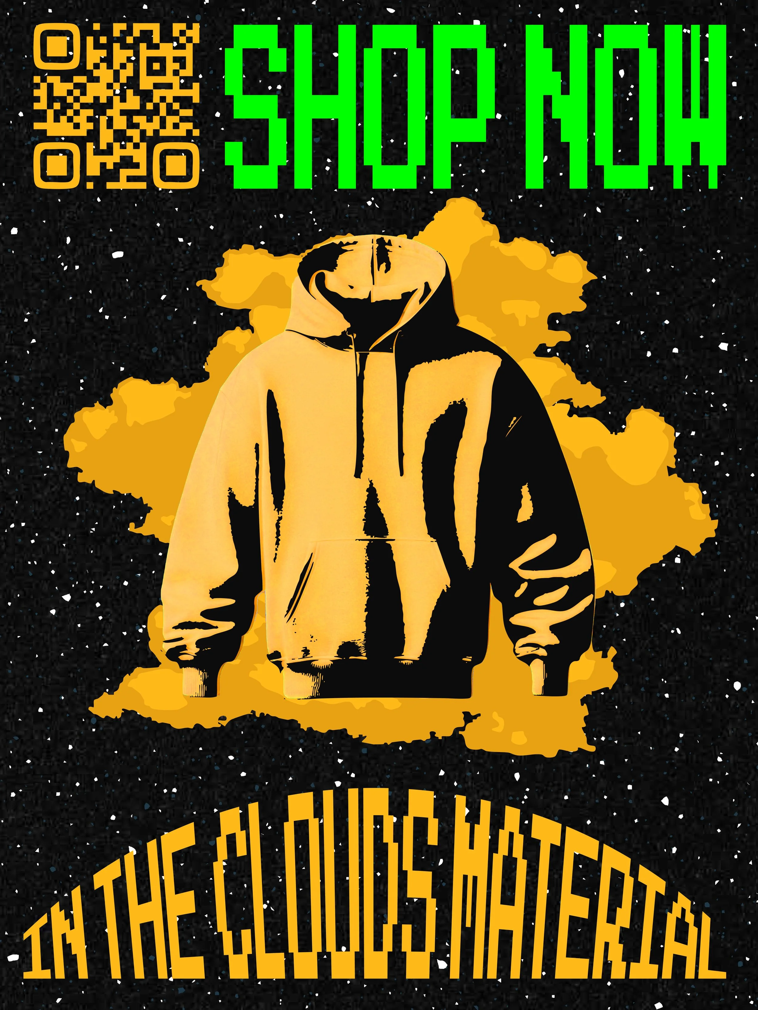
In the clouds material
The visual system blends softness with digital aesthetics, pixel typography, QR codes, and space imagery to create a contrast between technology and comfort. This turns comfort into a soft, digital experience that feels beyond the real world.
-
![]()
Color Palette
The color palette combines soft lavender with bright green and orange to balance comfort and digital energy. Black grounds the palette to make contrast and a tech-inspired feel.
-
![]()
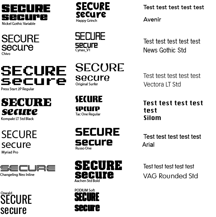
Deciding on a typeface
First I experimented with a bunch of different typefaces to weigh out all my options.
-
![]()
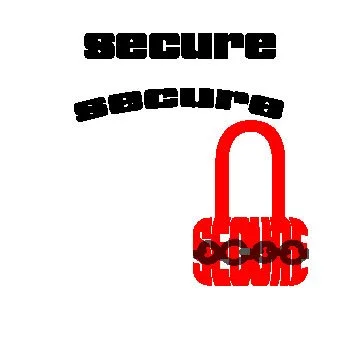
First logo attempt
When I thought of “secure,” I thought of a lock. After experimenting with the lock, the client and I both decided not to go this direction.
-
![]()
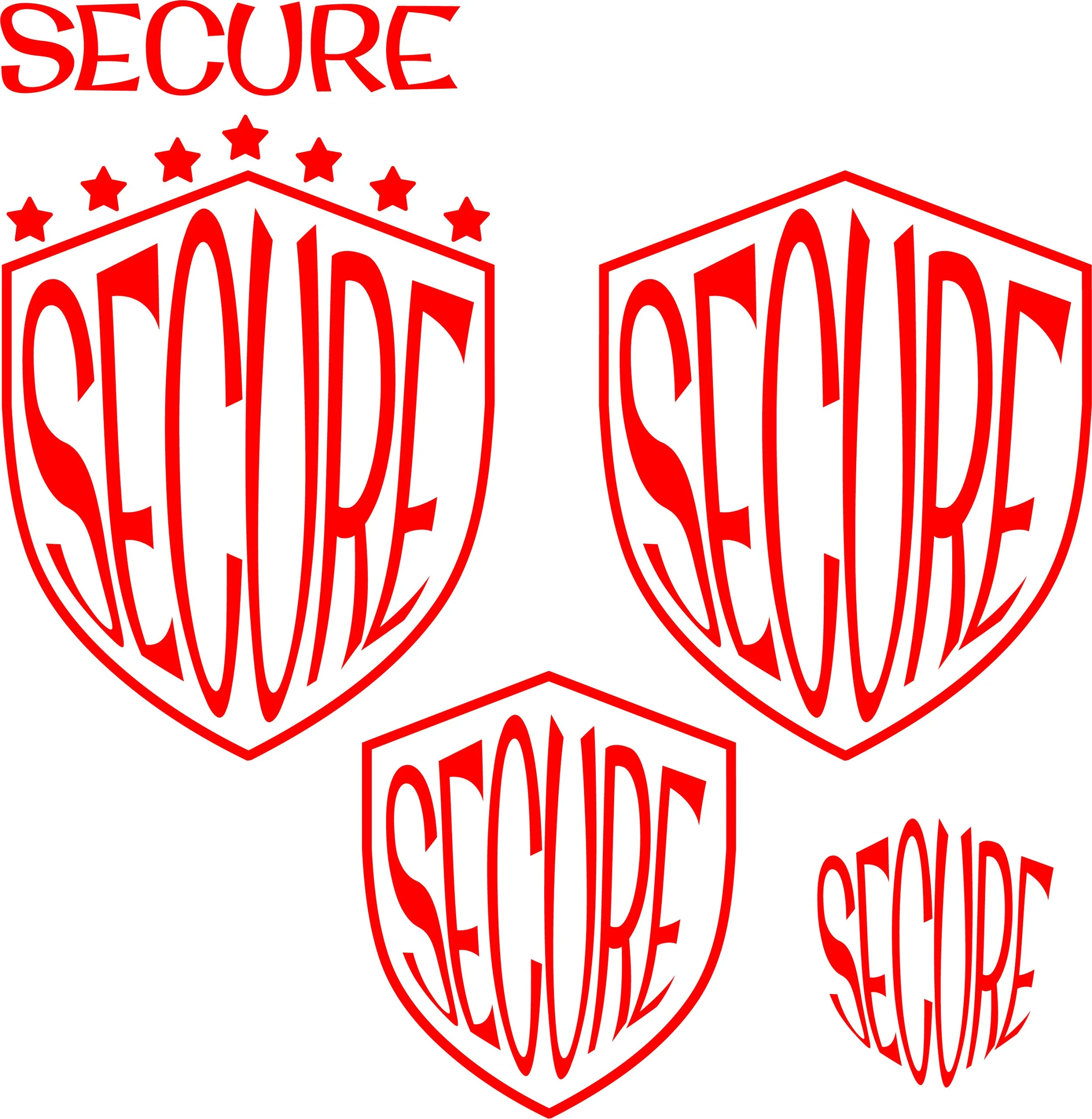
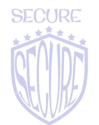
Next logo attempt
I explored more logo variations for Secure. I used a shield form to represent protection.
-
![]()
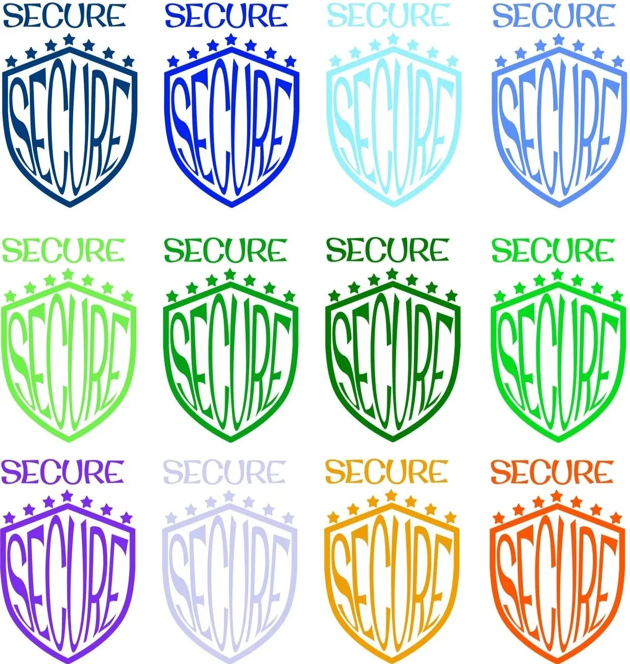
Variations
After narrowing my logo ideas down, I wanted to test out some colors.
-
![]()
Logo
Ultimately, I decided on the lavender one.
-
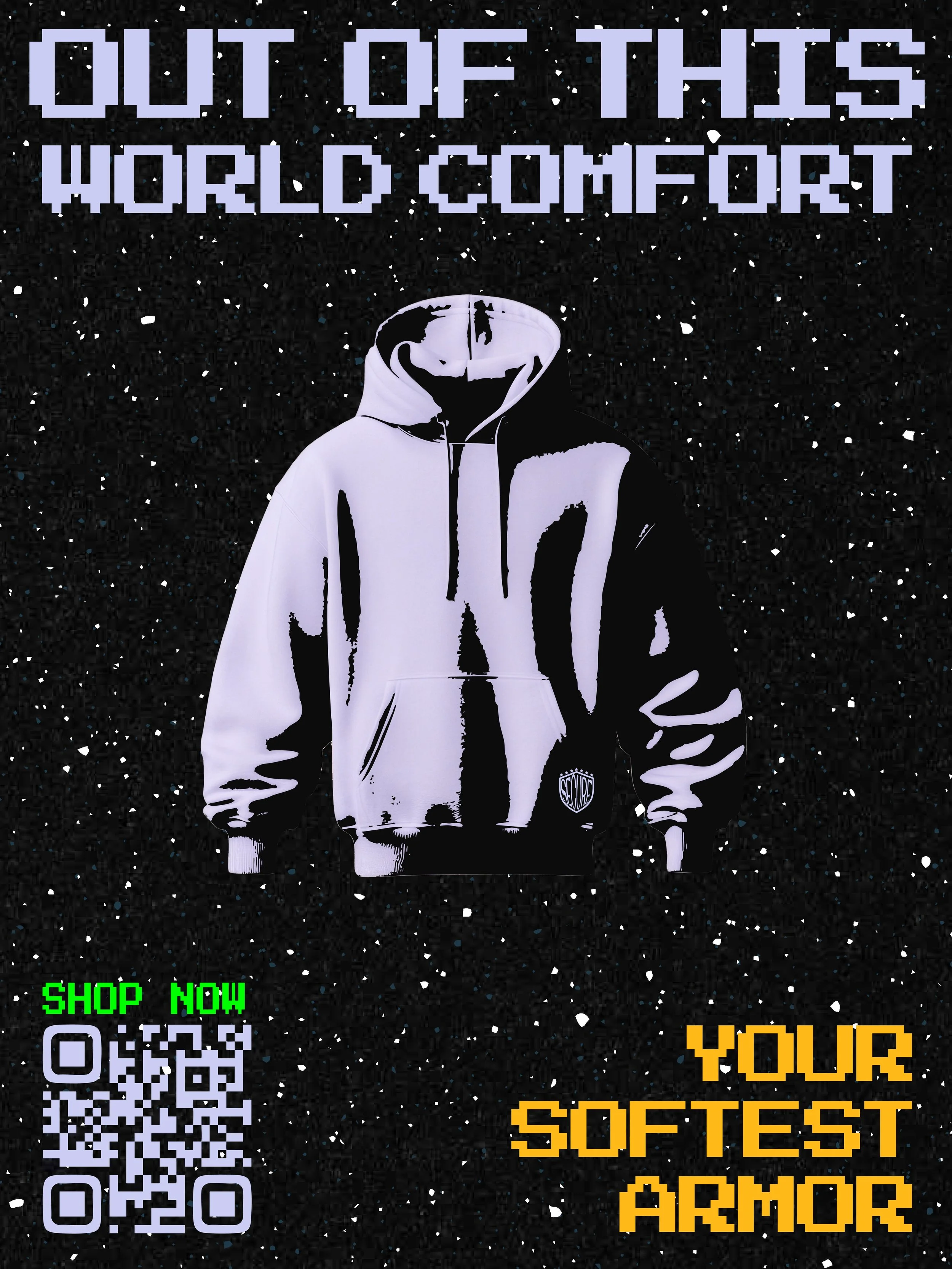
![]()
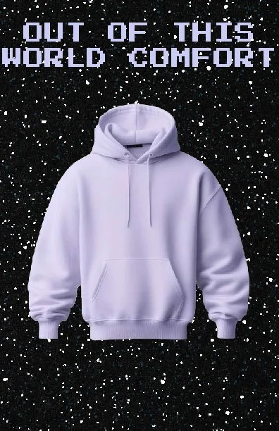
First Poster
First, I started with this poster. I had wanted to use a space background to push the “out of this world,” but it looked plain to me.
-
![]()
Variation 1
I brought the client multiple posters to see which direction they felt more toward.
-
![]()
Variation 2
I made the hoodie bigger here.
-
![]()
Variation 3
I moved around the “shop now” to fill in that space at the bottom.
-
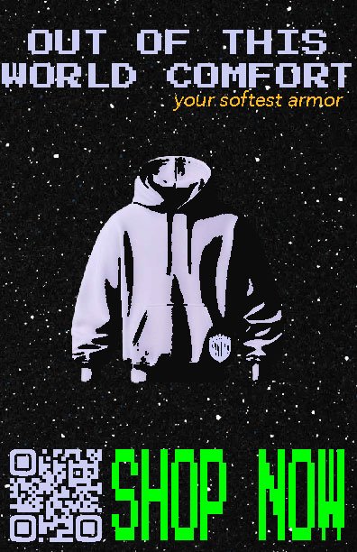
![]()
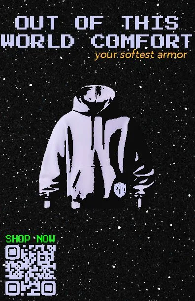
Final Poster 1
I changed “your softest armor” and put it in the same typeface as “out of this world comfort,” and I tightened the leading in between the words.
-
![]()
2nd Poster process
For my 2nd poster, I knew I wanted to do mainly orange and have it look similar to my first poster. I started experimenting with it. I wanted to add clouds to go with the “in the clouds material,” but the client and I weren’t feeling this one.
-
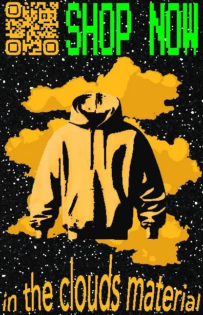
![]()
Final Poster 2
I rearranged the clouds behind the hoodie and changed the typeface to match the others