Cover art
A series of cover artworks created in response to different songs, exploring mood, typography, and visual interpretation through bold color and imagery.
-
![Final Cover Process]()
Final Cover Process
This is the final cover the client settled on.
-
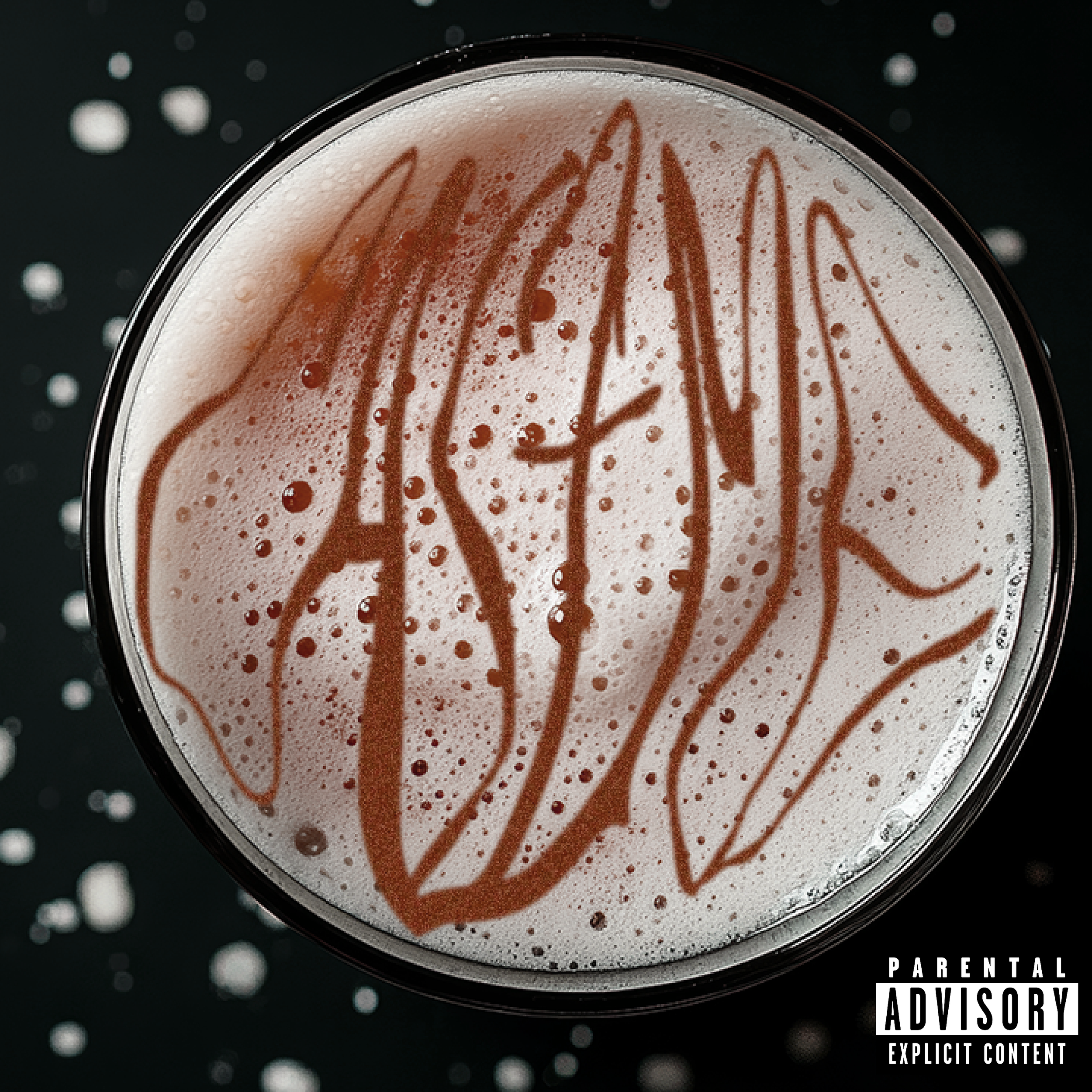
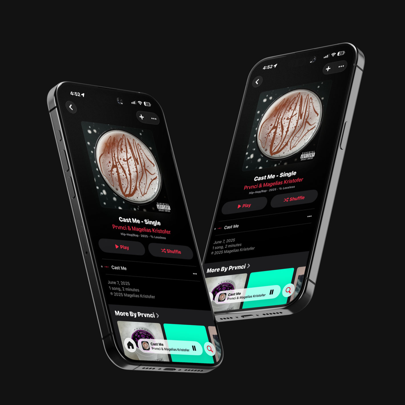
![]()
Cast me cover
Cast Me, out on all platforms.
-
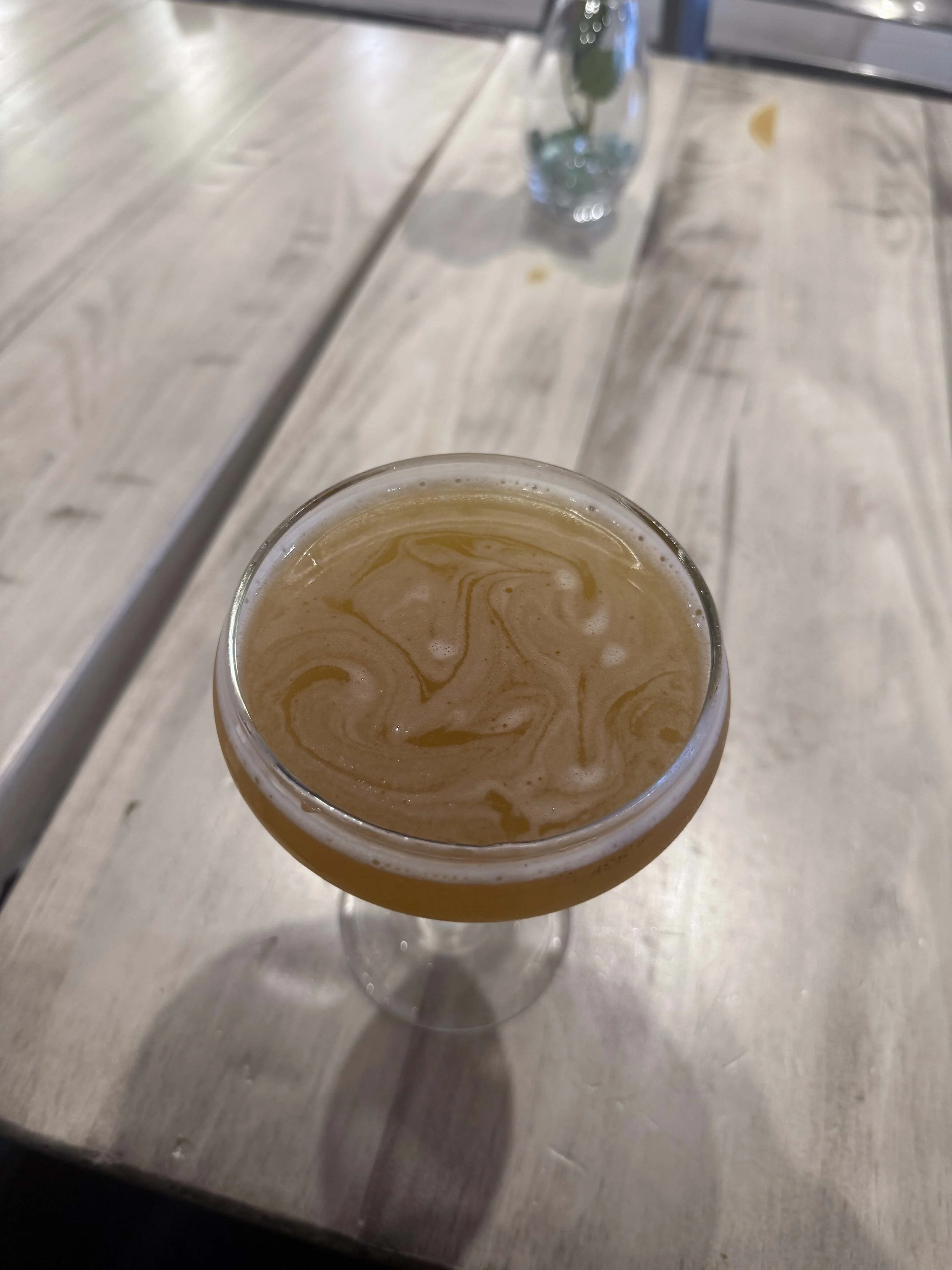
![]()
Inspiration
I was looking at my drink and I used my straw to start drawing lines into the fizz of the drink, and I thought that would be a cool graphic.
-
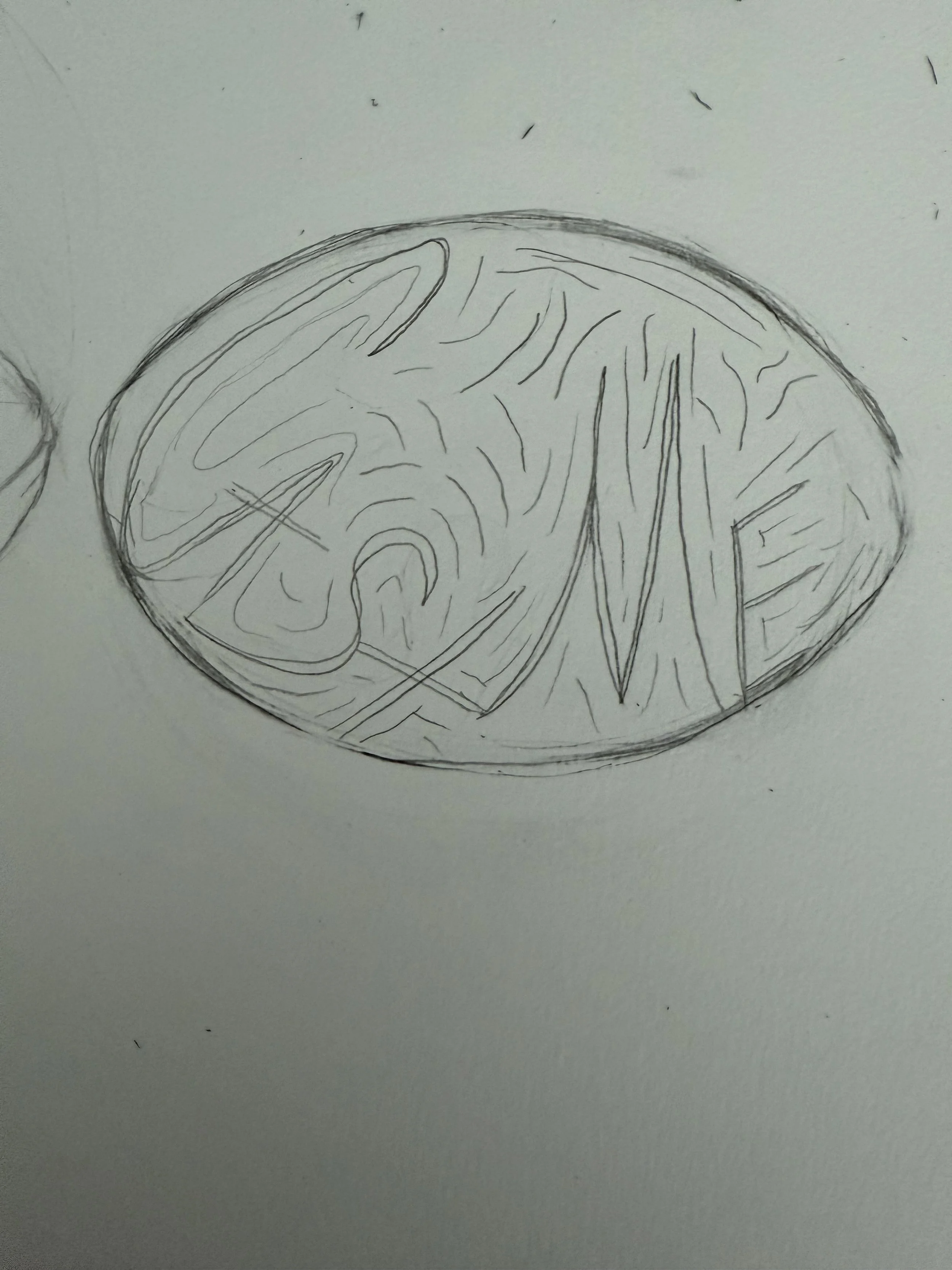
![Sketch]()
Sketch
I started sketching how I could possibly make the letters look.
-
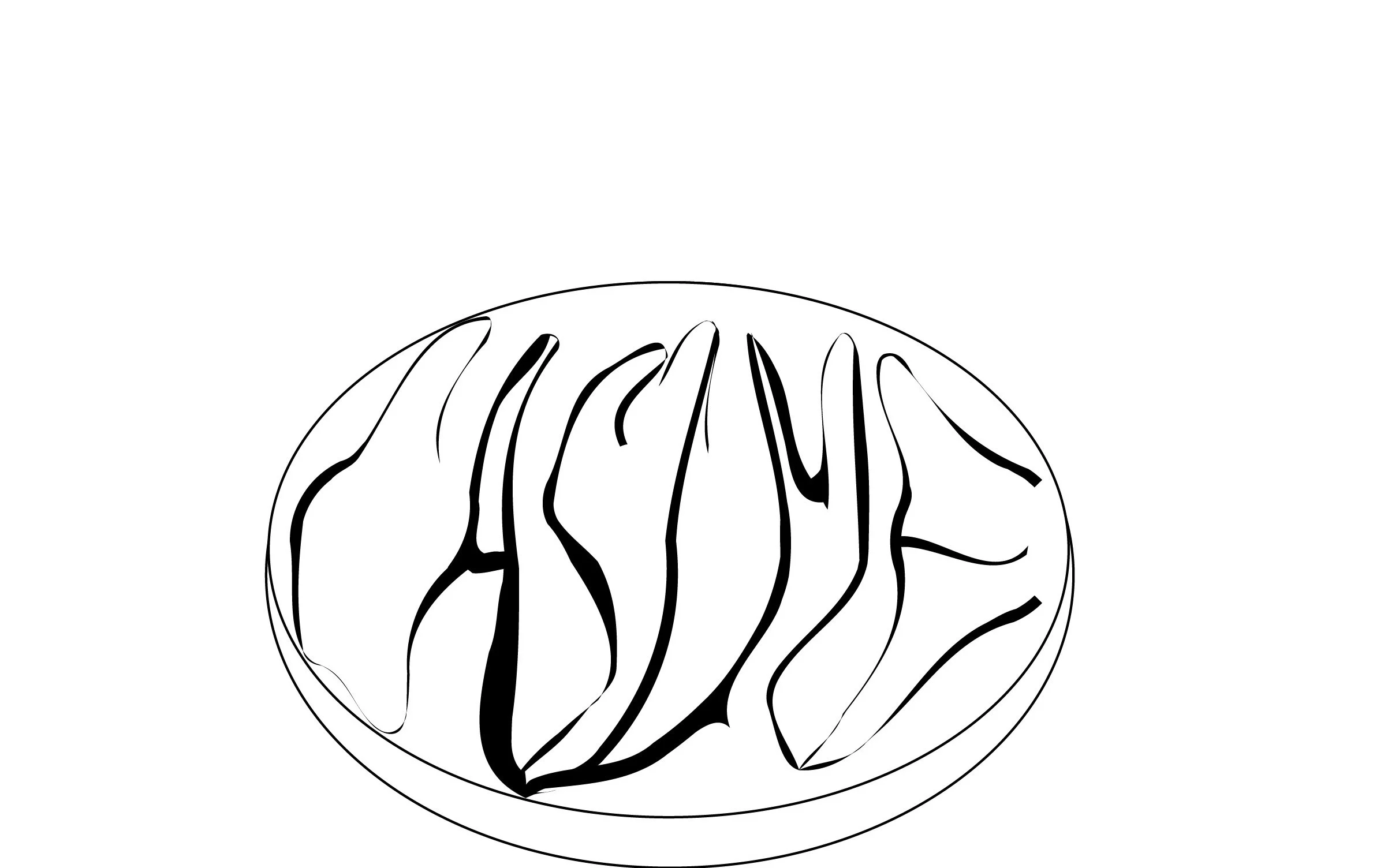
![]()
Vector
Then I created a vector.
-
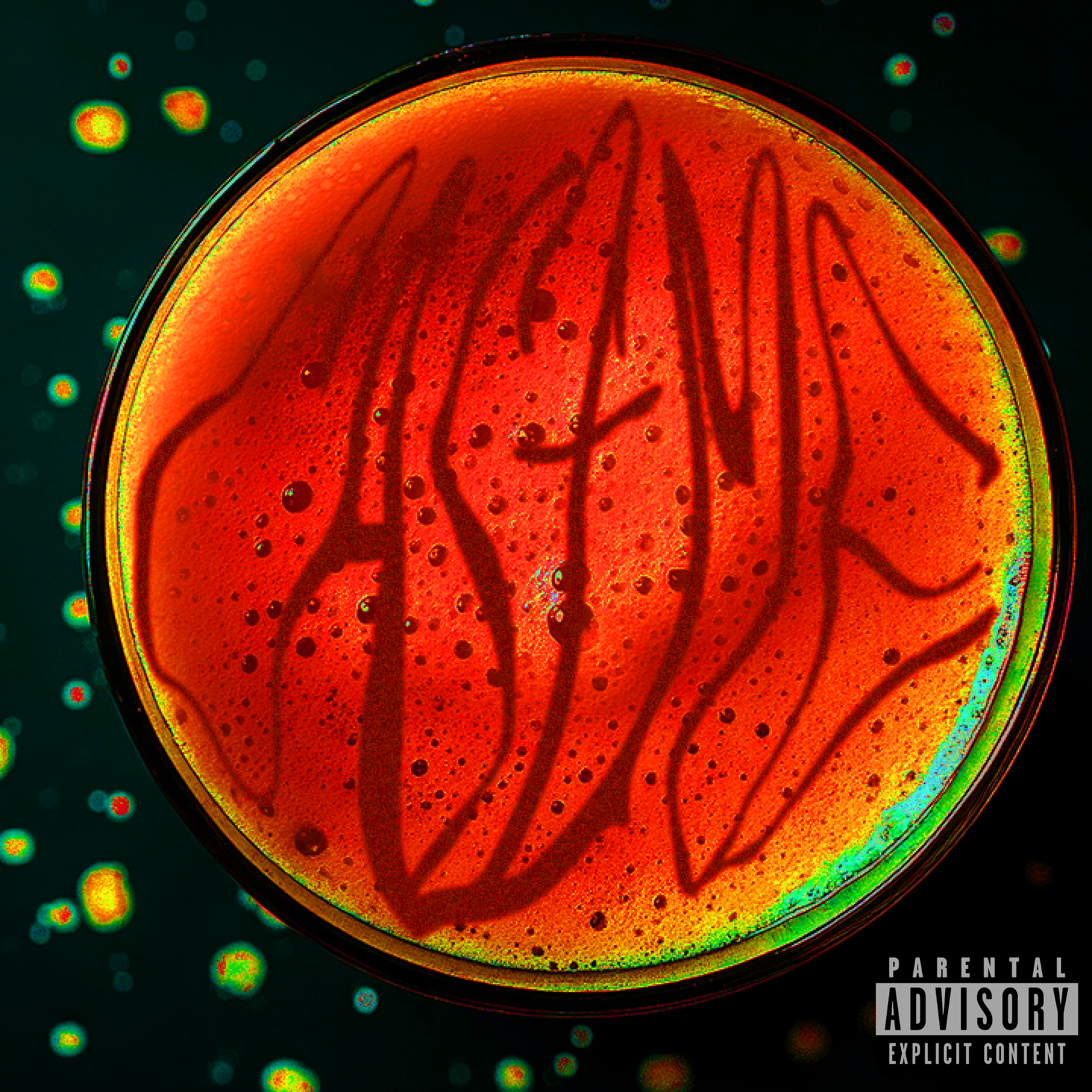
![]()
Variation 1
I started experimenting with different colors.
-
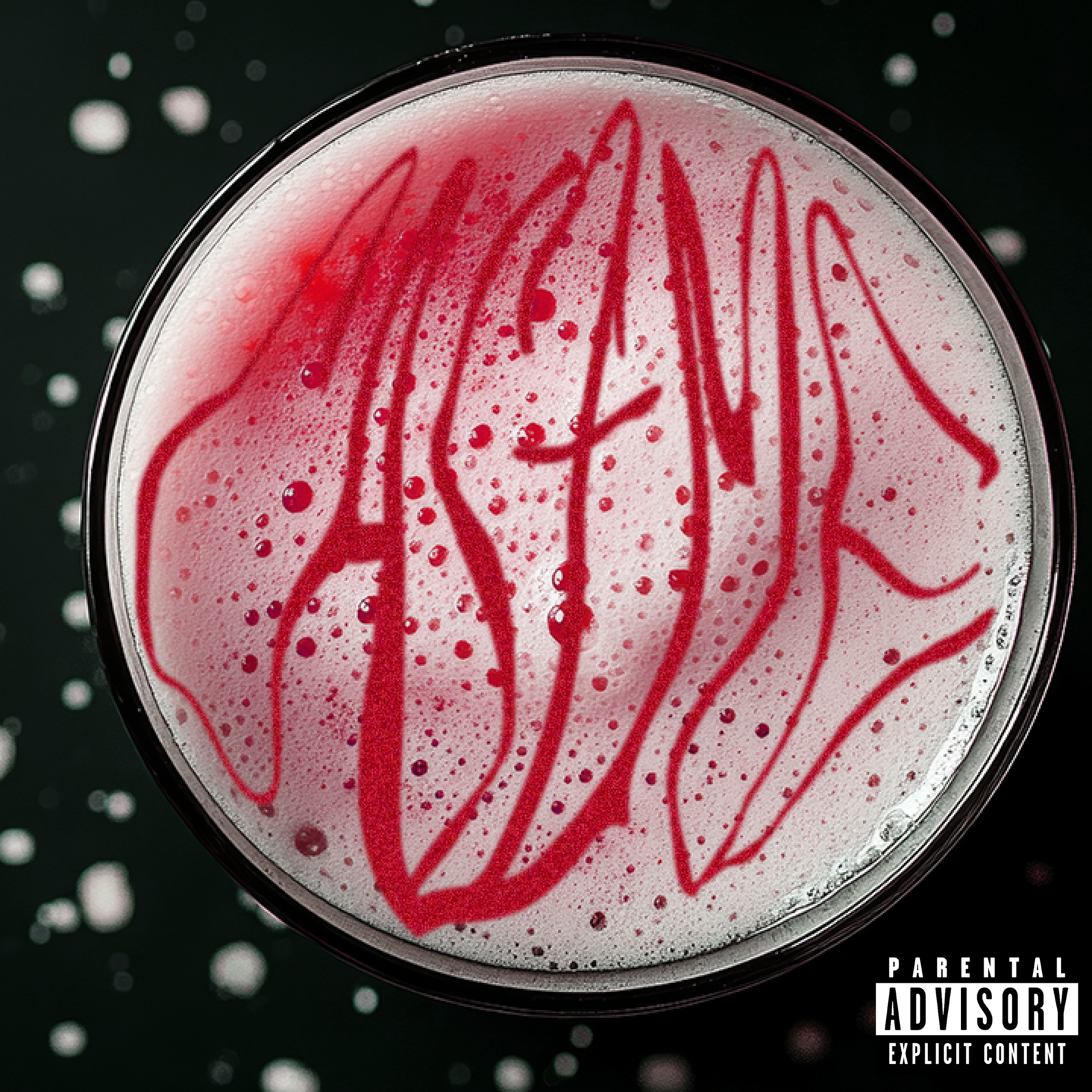
![]()
Variation 2
-
![]()
Variation 3

-
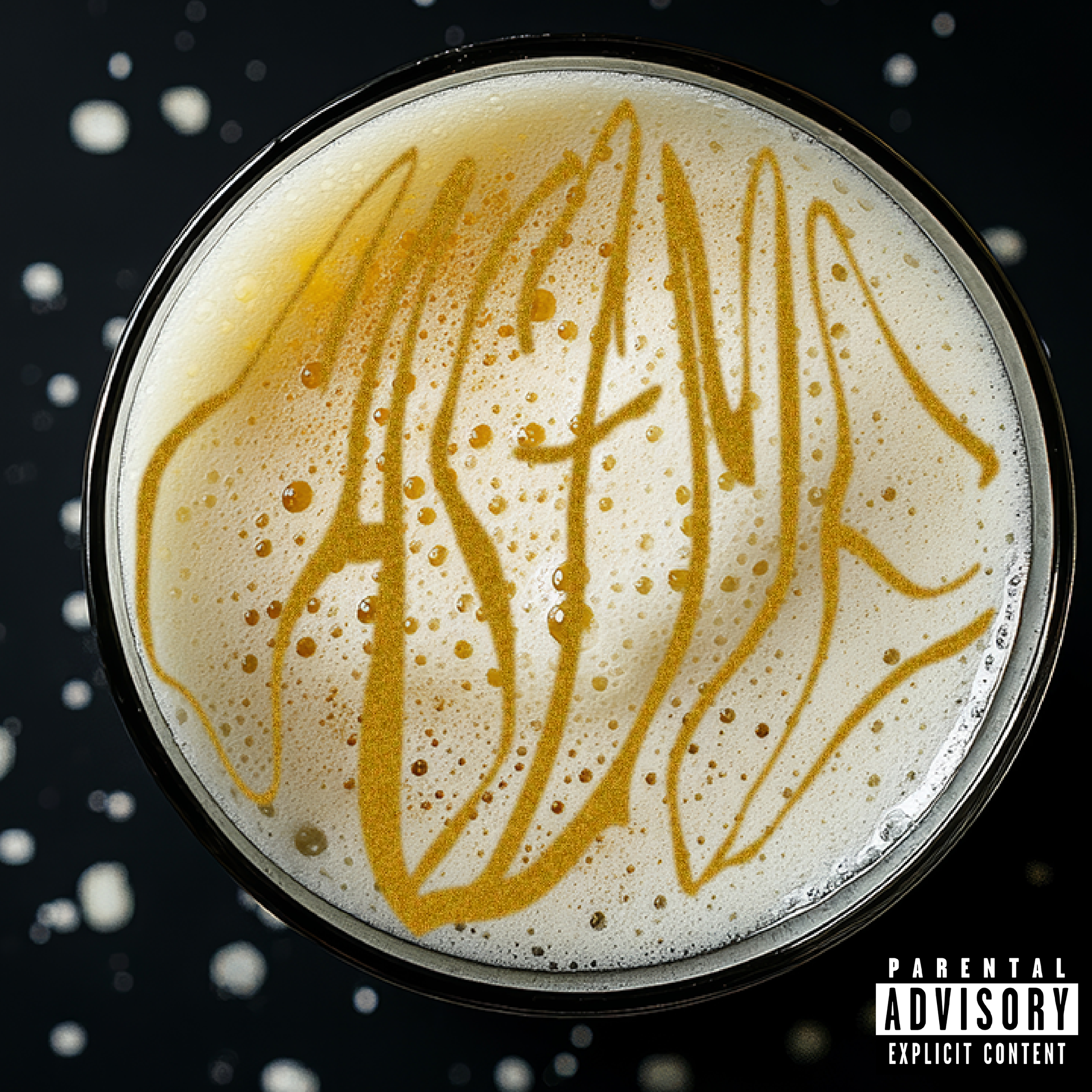
![Final Cover Process]()
Final Cover Process
This is the final cover the client settled on.
-
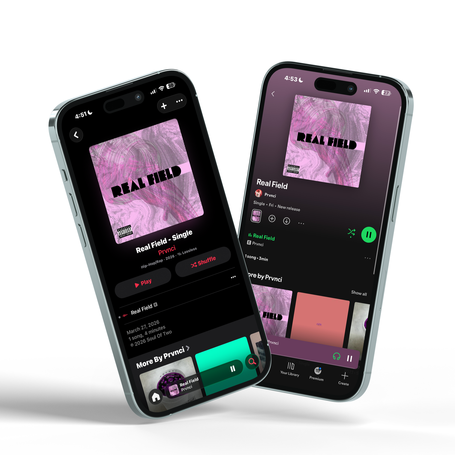
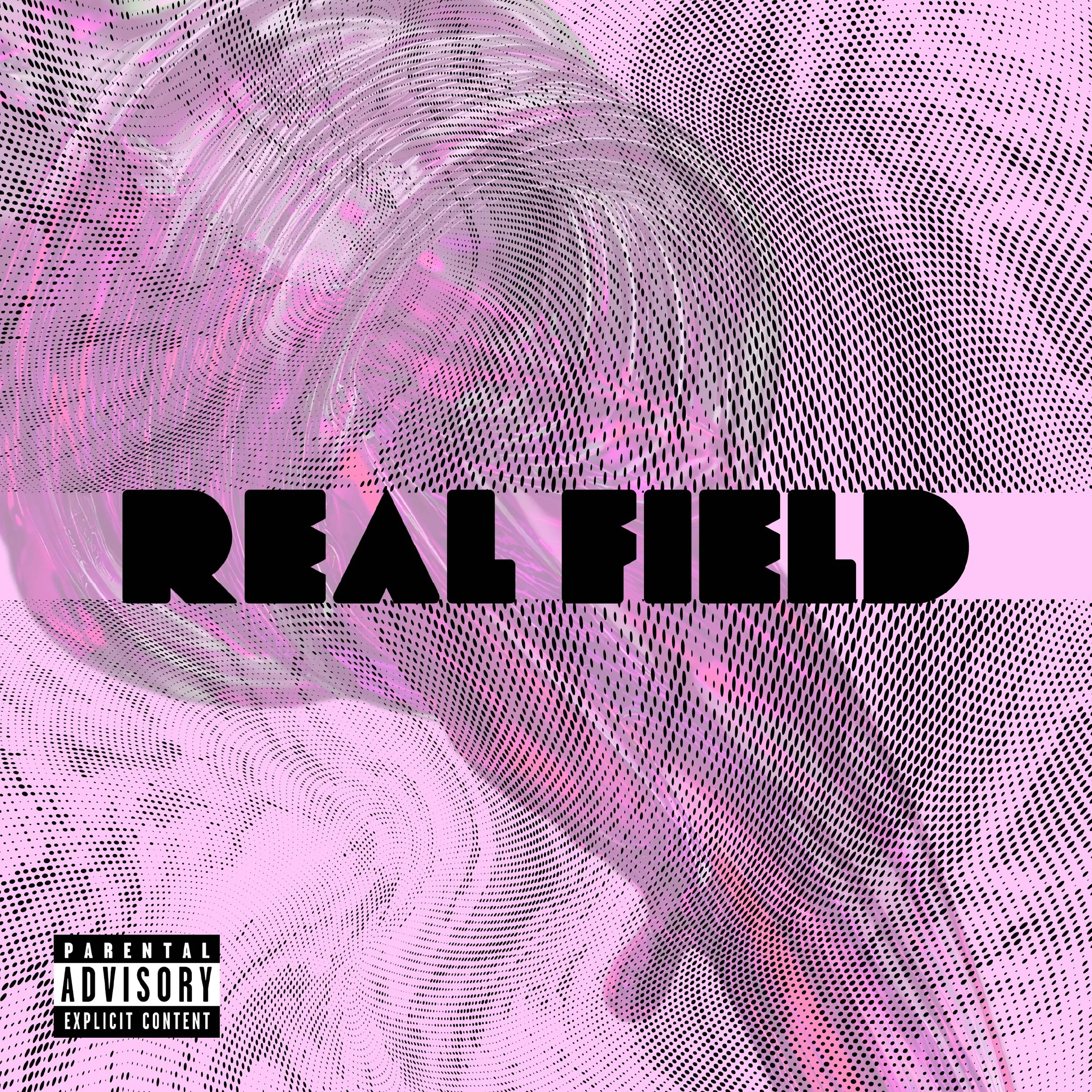
![]()
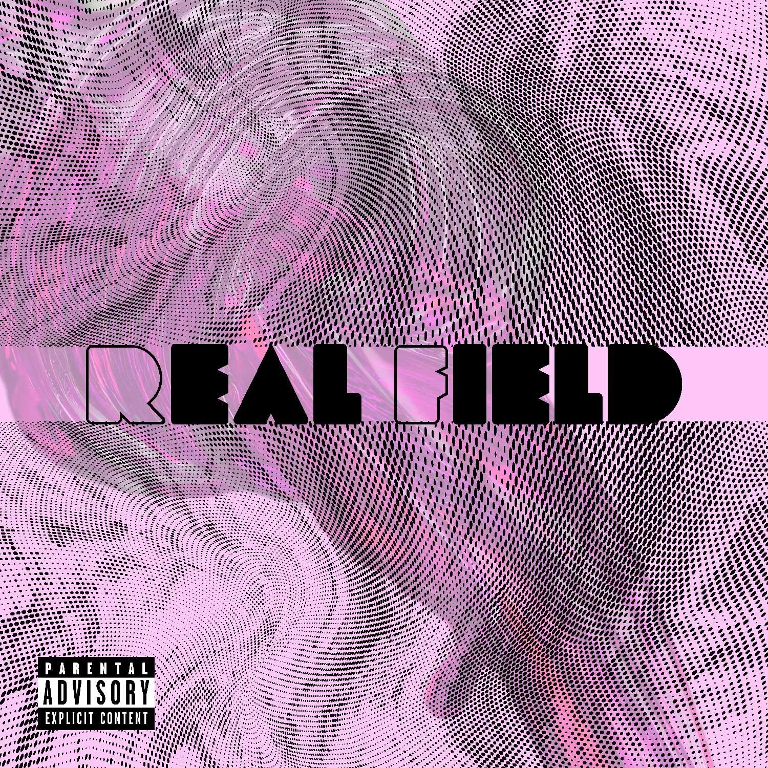
Real Field cover
Real Field, out on all platforms.
-
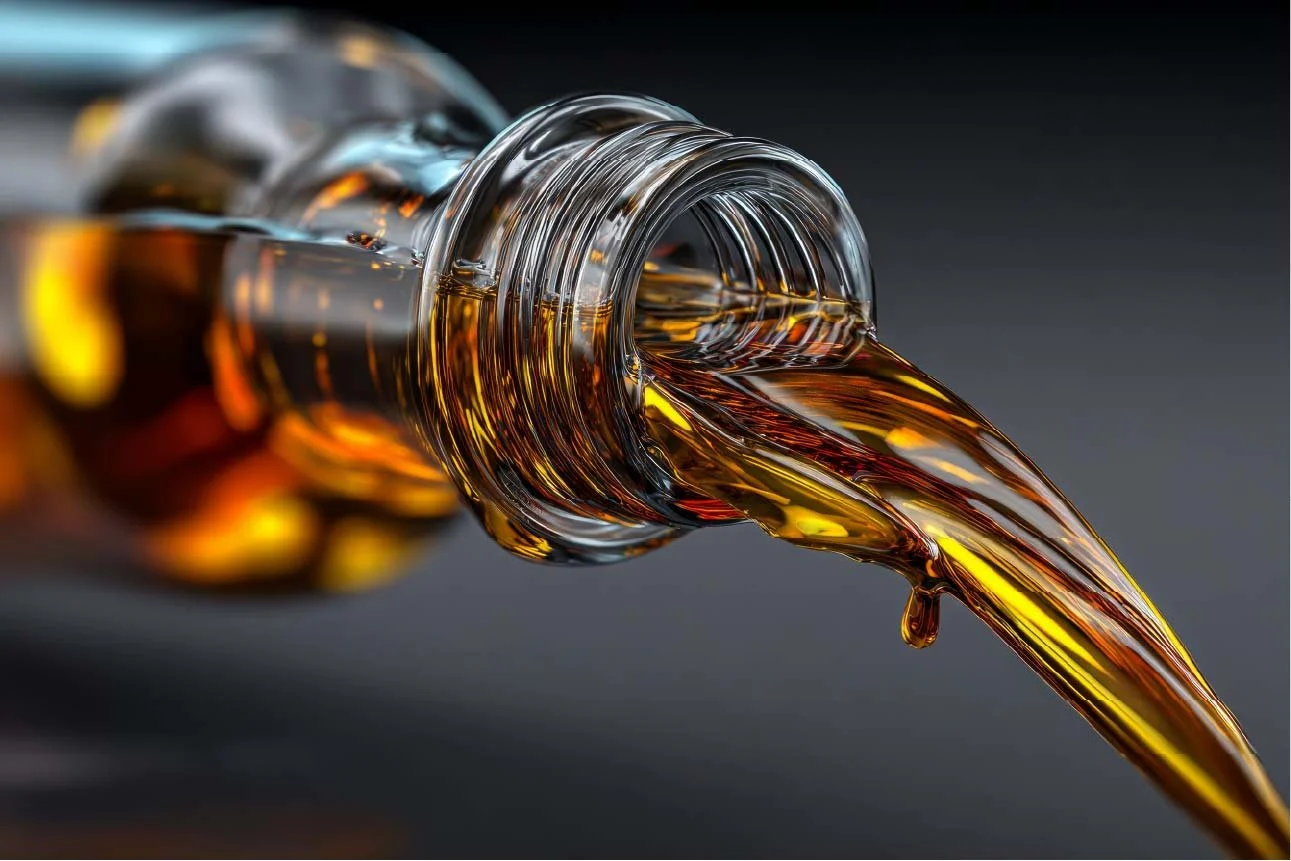
![]()
Inspiration
I had seen this image of a bottle being poured, and I just knew I wanted to do something with it.
-
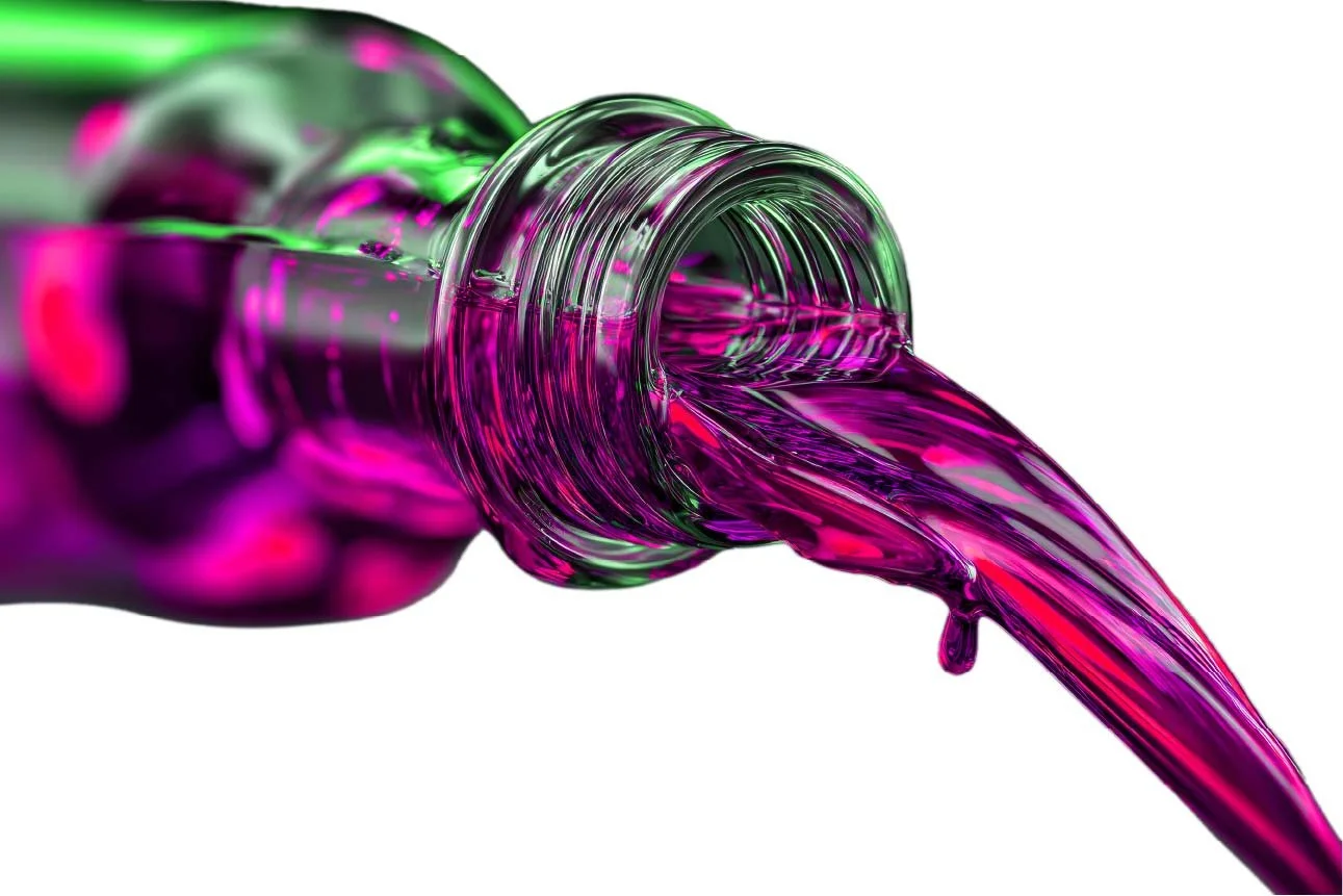
![Process]()
Process
I got rid of the background and started playing around with the saturation.
-
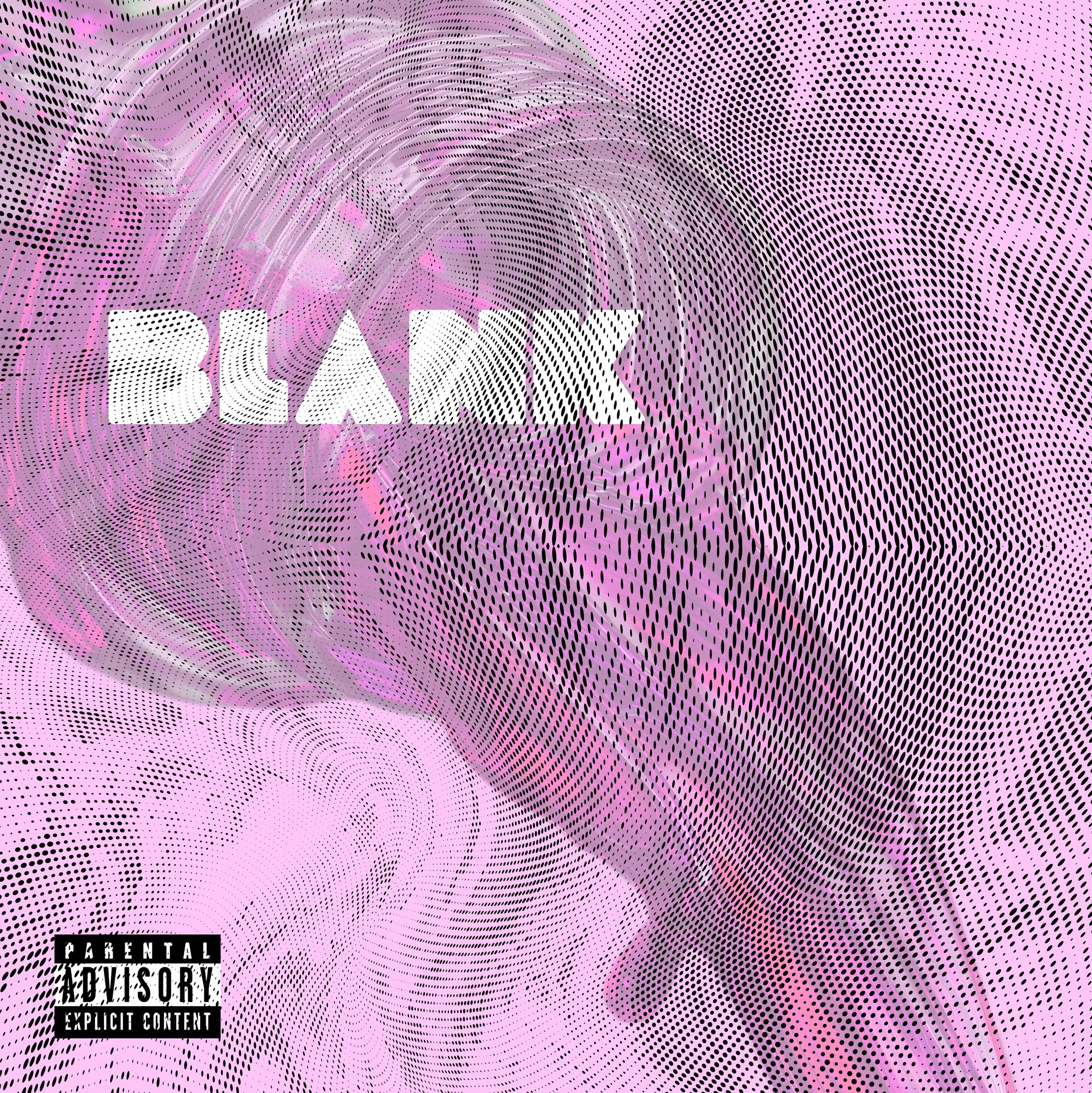
![]()
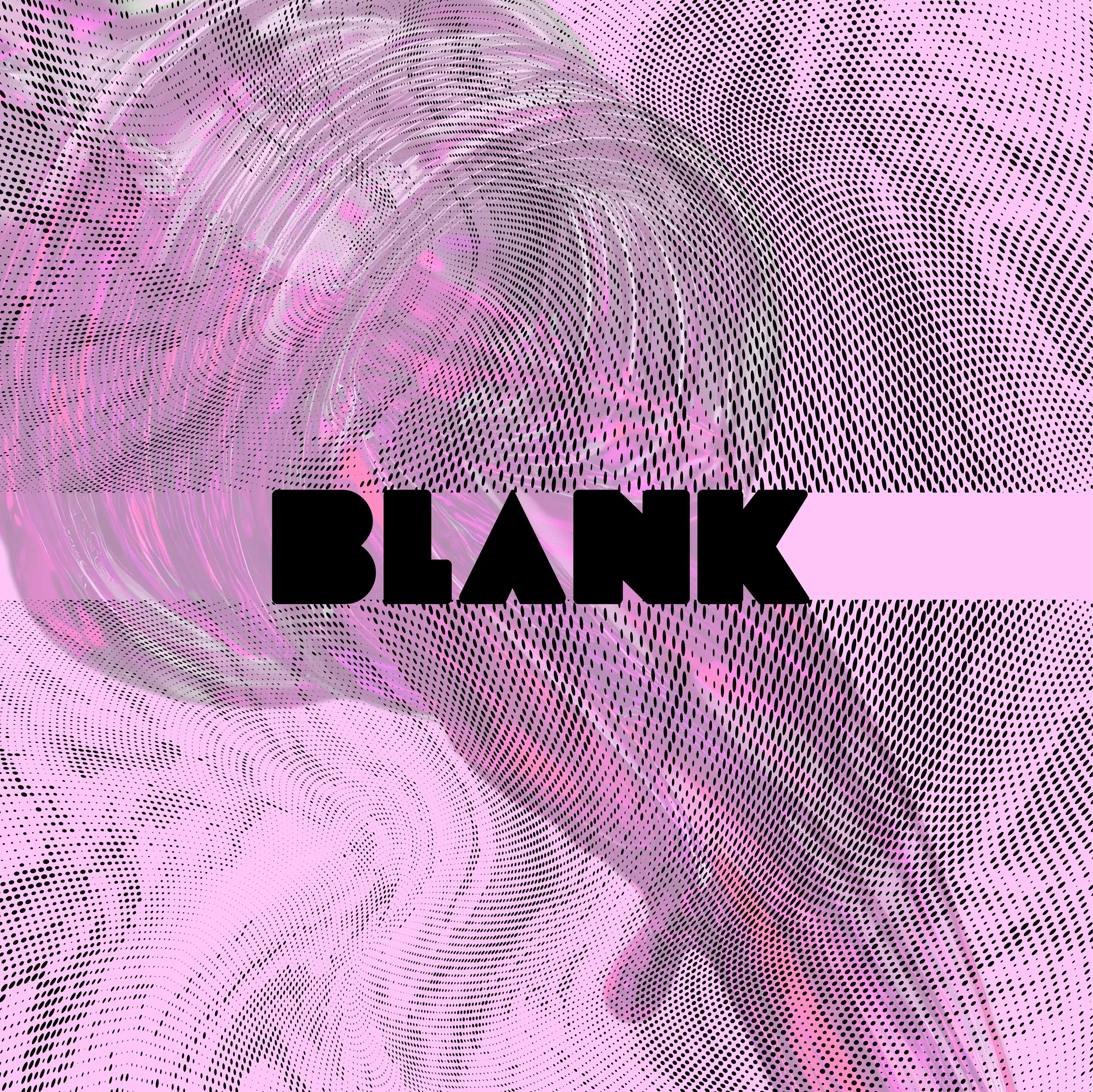
Process
The client hadn’t decided on a title yet, but I began experimenting anyway. First, I tried putting “Blank” as the title placeholder in the bottle. I liked it, but I wanted to keep trying.
-
![Process]()
Process
I decided to put it in the middle. I wanted to have a negative flat space.
-
![]()
Variation 1
After the client decided on a title, I messed around with the typeface some more.

-
![Final Cover]()
Final Cover Process
This is the final cover the client settled on.
-
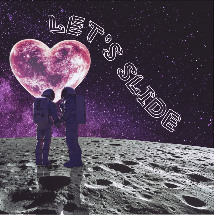
![]()
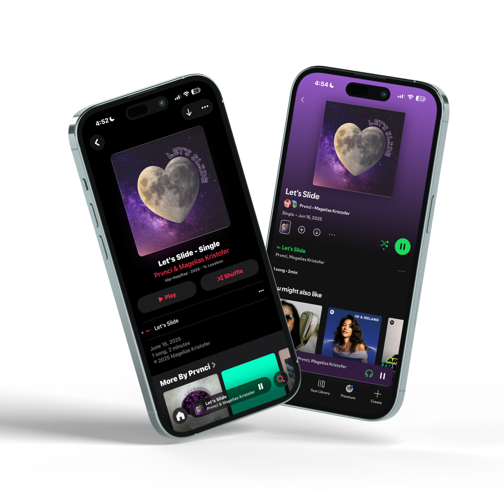
Let's Slide cover
Let’s Slide, out on all platforms.
-
![]()
Inspiration
When I first heard the song, I imagined the cover’s setting taking place in space.
-
![Inspiration]()
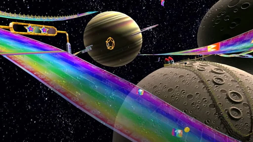
Inspiration
The beat made me think of Mario Kart, the space map in particular.
-
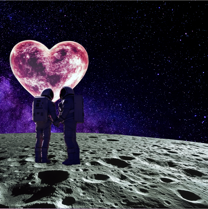
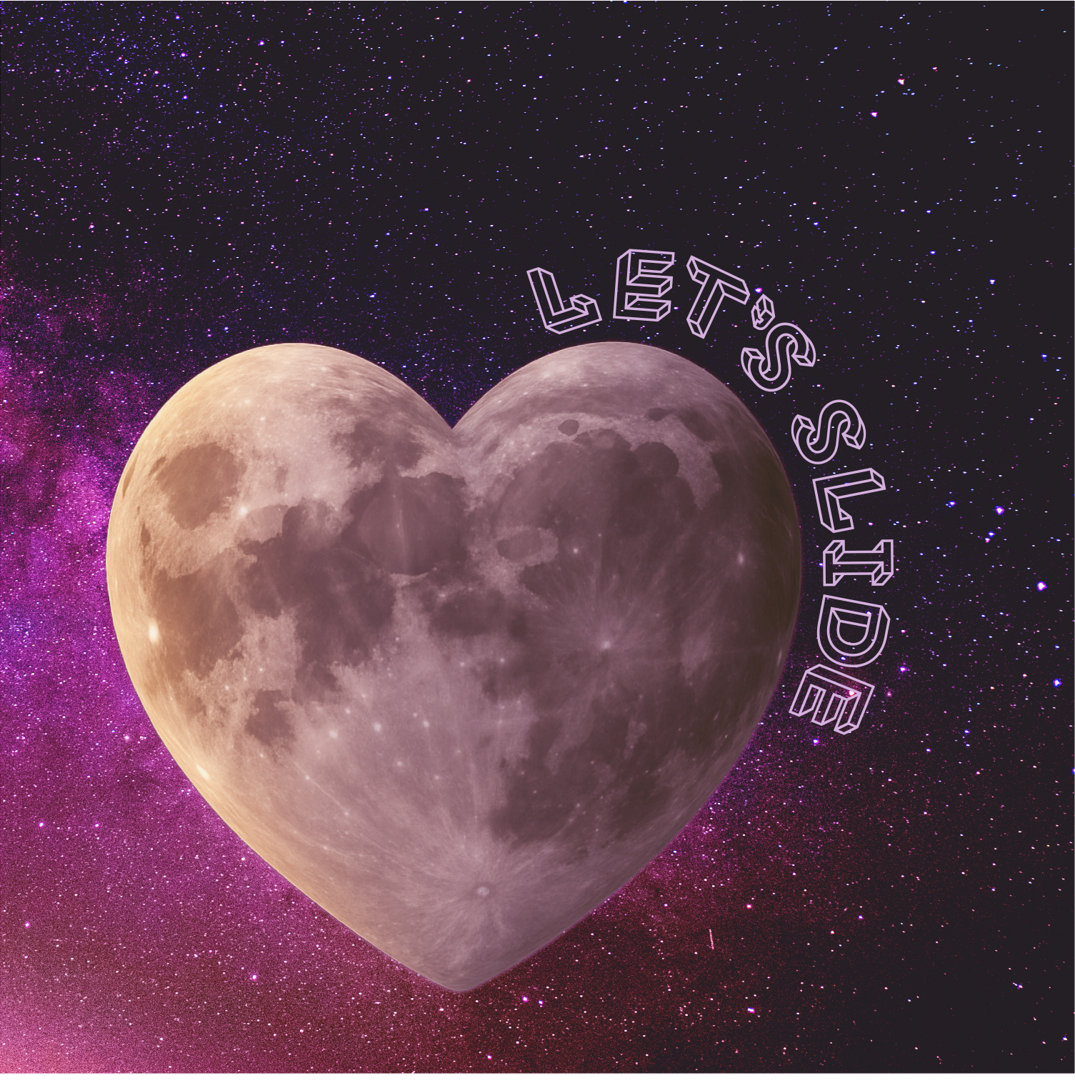
![Draft]()
Draft
The song is about attraction, chemistry, and vibes. So I was leaning towards 2 astronauts holding hands on the moon.
-
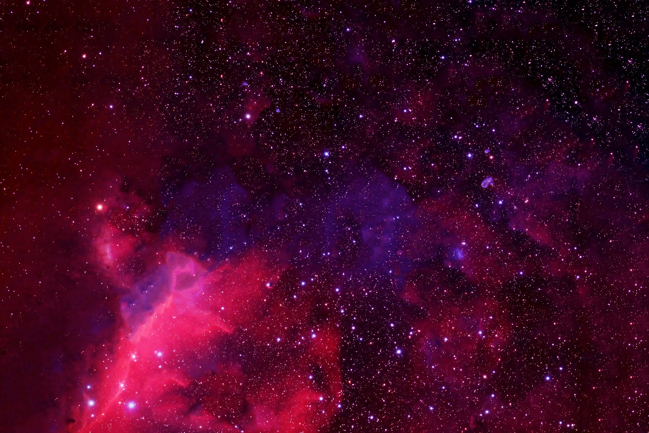
![]()
Variation 1
I continued exploring, but the client didn’t feel this direction and asked to simplify.
-
![]()
Variation 2
-
![]()
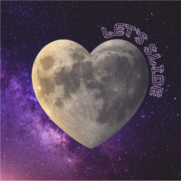
Variation 3
I decided to center everything down the middle, and the client chose this one.